

Have you ever wondered how your brain instantly makes sense of the busy visual world around you? Before you consciously register individual details, your mind automatically organizes shapes, colors, and spaces into meaningful patterns and clear groups.
This seamless cognitive shortcut relies on the Gestalt Principles of Visual Perception—a set of psychological concepts introduced in the early 20th century explaining how we interpret visual information as unified wholes rather than isolated parts. Whether you are navigating a smartphone app, reading a menu, or simply scanning a room, these foundational rules shape everything you see and interact with every day.
Here is a breakdown of the seven key principles that dictate how our visual minds work:
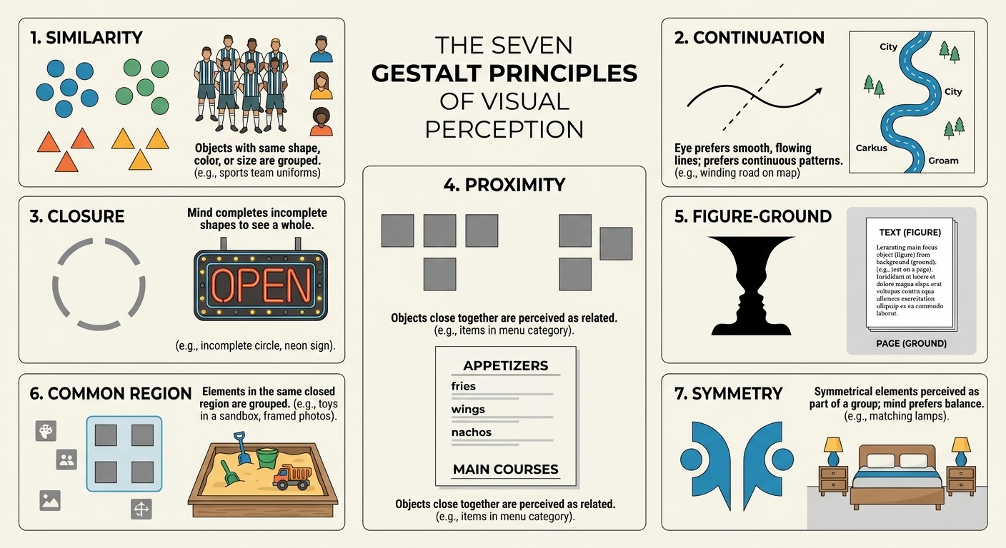
1. Similarity
Objects that share visual characteristics—such as color, shape, size, or texture—are instinctively perceived as part of the same group or category. Our brains look for common threads to categorize information quickly.
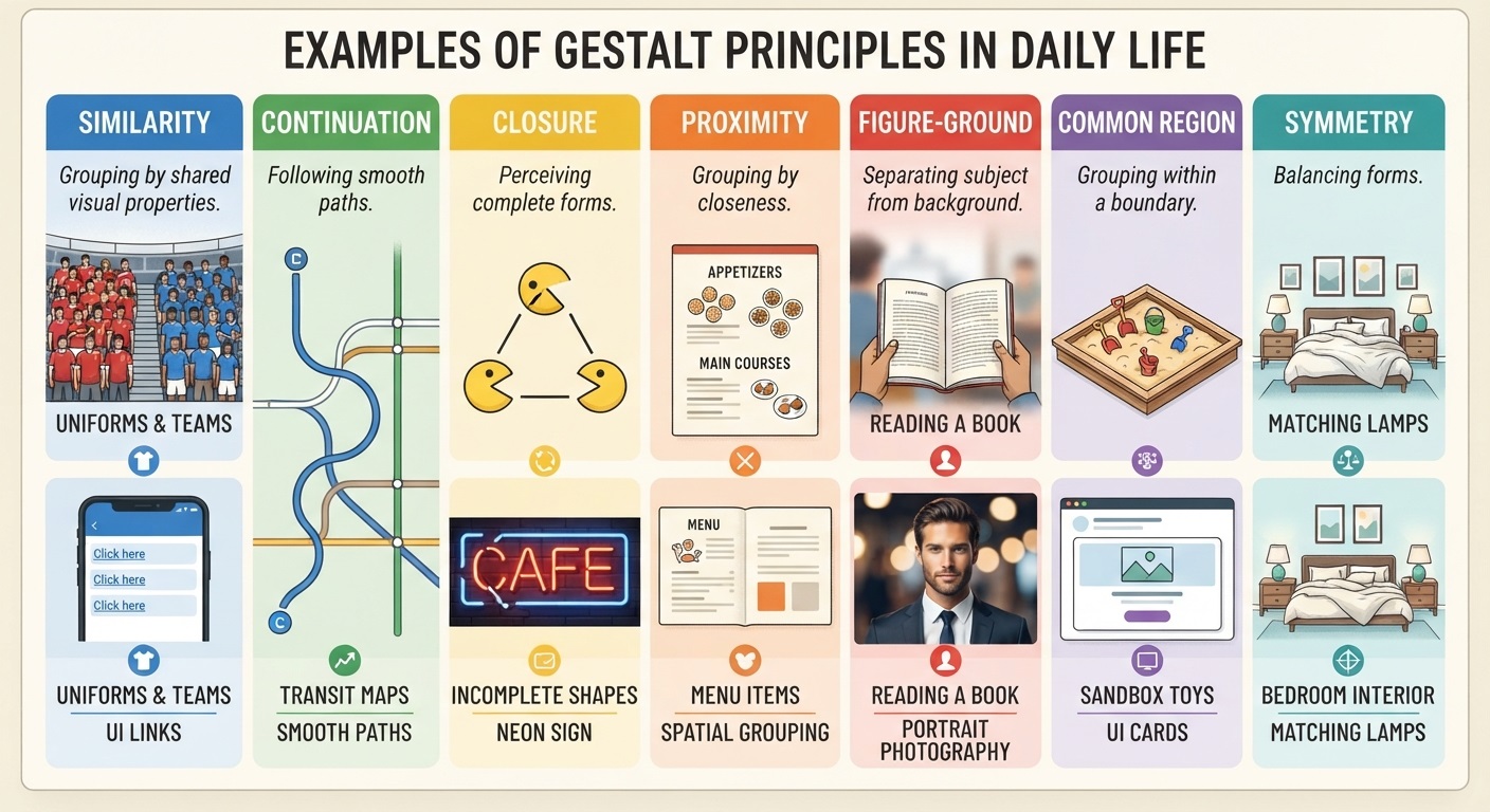
- Everyday Example 1 (Uniforms & Teams): When you watch a football match, you instantly distinguish team members from opponents and referees simply by the color of their jerseys, grouping players based on their similar appearance.
- Everyday Example 2 (Digital Interfaces): On a website or app, clickable text links are usually styled in the same color (like blue) and underlined. Your brain instantly recognizes all blue words as interactive links because of their shared similarity.
- Everyday Example 3 (Data Tables): In a spreadsheet, rows or columns that alternate in shading help your eyes follow data across rows without losing your place.
2. Continuation (Good Continuation)
The human eye naturally follows lines, curves, or a sequence of shapes in a continuous path rather than shifting abruptly to disconnected elements. We prefer smooth, flowing transitions over jagged or broken forms.
- Everyday Example 1 (Road Maps & Transit): When looking at a metro map or road navigation app, you perceive a winding highway or subway line as a continuous, flowing path, even when it intersects with other routes or text labels.
- Everyday Example 2 (Musical Staff): Sheet music uses musical notes arranged along continuous horizontal lines (staves), allowing the eye to sweep across the page smoothly to read notes in chronological order.
- Everyday Example 3 (Text Design): Waves of bullet points or text aligned along a smooth curve in a magazine layout pull the reader’s gaze effortlessly across the page.
3. Closure
When presented with an incomplete shape, outline, or text string, the human brain automatically fills in the missing visual information to create a whole, recognizable image. We hate loose ends and prefer completeness.
- Everyday Example 1 (Neon Signs & Marquees): If you see a storefront neon sign where a few lightbulbs have burned out (e.g., “OPEN” missing part of the ‘P’), your mind instantly bridges the gap so you can still read the intended word.
- Everyday Example 2 (Famous Logos): Iconic logos like the WWF panda or the IBM striped letters use minimal or broken lines; our brains supply the missing visual data to complete the animal or letters effortlessly.
- Everyday Example 3 (Reading Handwriting): When someone writes quickly with connected or missing strokes, you can still read their cursive handwriting because your mind fills in the missing loops and curves based on context.
4. Proximity
Objects that are positioned close to one another are perceived as more closely related than items spaced farther apart. Spatial distance is one of the most powerful tools for organizing information visually.
- Everyday Example 1 (Restaurant Menus): On a menu, items listed right next to a specific price or within a tight block are understood to belong to the same dish, whereas a wide gap separates appetizers from desserts.
- Everyday Example 2 (Smart Device Home Screens): App icons on your smartphone that are grouped closely on a single screen or inside a folder are perceived as related tools (e.g., all productivity apps in one cluster, social media apps in another).
- Everyday Example 3 (Grocery Shopping Lists): If you jot down “milk, eggs, cheese” on one line and leave space before writing “apples, bananas,” your brain categorizes them into dairy and produce sections respectively.
5. Figure-Ground
This principle describes our perceptual tendency to separate objects into a foreground (“figure”) and a background (“ground”). The figure is the primary point of focus, while the ground recedes into the background context.
- Everyday Example 1 (Reading a Book): When reading a printed novel, the dark text stands out distinctly as the “figure” (foreground) while the bright white paper acts as the “ground” (background), allowing you to focus completely on the words.
- Everyday Example 2 (Conversations at a Party): In an auditory version of figure-ground perception, you can focus on a single person speaking directly to you (figure) while the rest of the room’s chatter fades into ambient noise (ground).
- Everyday Example 3 (Photography): A portrait photographer uses a shallow depth of field (blurry background) to make the subject pop out clearly against the scenery.
6. Common Region
Elements located inside the same enclosed boundary, container, or background shade are perceived as part of a single unified group, even if the items themselves are dissimilar.
- Everyday Example 1 (Playground Sandboxes): In a park, toys scattered across a sandbox are immediately perceived as belonging to the play area because the wooden border creates a distinct common region around them.
- Everyday Example 2 (UI Card Design): Modern web design frequently uses “cards” (boxes with subtle shadows or borders) to bundle a product image, title, price, and “Buy Now” button into a single, cohesive unit.
- Everyday Example 3 (Forms & Checklists): Tax forms or registration pages use boxed sections or colored background containers to group related personal questions together (e.g., “Contact Information” vs. “Billing Details”).
7. Symmetry
Symmetrical elements are perceived as belonging together, creating a sense of balance, stability, and order. Our minds naturally seek harmony and prefer symmetrical arrangements over chaotic ones.
- Everyday Example 1 (Interior Design): A bedroom featuring matching nightstands and lamps on either side of a bed creates an immediate sense of visual balance, prompting the brain to group them as a coordinated set.
- Everyday Example 2 (Architecture & Facades): The front face of a classic building with symmetrical windows, columns, and a central doorway looks unified and organized to anyone looking at it.
- Everyday Example 3 (User Interfaces): Centered login screens or balanced dashboard layouts feel more trustworthy and calm to users because of their predictable, symmetrical structure.
Informative Resources & Further Reading
- The Interaction Design Foundation: Exploring Gestalt Principles – An in-depth look at how Gestalt psychology applies directly to UI/UX and visual interface design.
- Gestalt Principles Interactive Guide – Interactive visual demonstrations showcasing how each principle functions in real-time.
- Smashing Magazine: Design Principles: Visual Perception And The Principles Of Gestalt – A comprehensive guide on applying perceptual grouping to visual communication.

